Brand & eCommerce · 9 weeks

MobiVerse sells refurbished phones on a published standard, not a trust badge.

MobiVerse have refurbished phones in Kolkata since 2013 and were ready to sell direct. The brand, the store and the reason to trust a stranger’s used phone did not exist yet.

30-min call with a senior lead · Reply within 1 business day · NDA on request

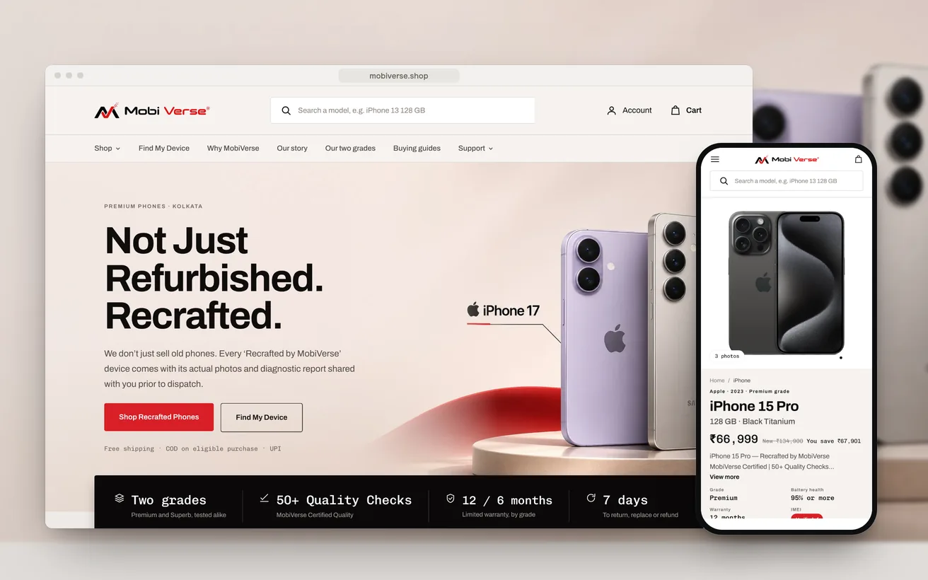
The MobiVerse Shopify store on desktop and phone: the homepage and the iPhone 15 Pro product page with its grade, battery floor and warranty
Client
MobiVerse
Sector
Refurbished smartphones
Market
India
Timeline
9 weeks
Services
Brand strategy, Identity, UX & UI, Shopify Development
1,786

Variants, launch-ready

2

Grades, one published standard

Build figures. Trading results will be added after launch.

01 The challenge

MobiVerse had thirteen years of refurbishing behind them and no consumer brand. The plan was to sell iPhones, Galaxys and Pixels direct, to buyers across India who had never heard the name.

Every store in the category already claims trust. None of them proves it.

Before drawing a page we went through six Indian refurbished-phone stores the way a buyer would. Each one led with a quality-check count and a warranty badge. Buyers have seen those badges so often that they no longer read them, and none of the six showed the condition of the phone that would actually arrive.

The buyer we designed for is 22 to 35, shopping on a phone, and has already priced the same model on three other sites. They arrive with five objections: it is someone else’s broken phone, the photos won’t match, the battery will die in six months, it could be stolen, and nobody will answer if it fails. A listing that leaves any of those open loses the sale.

02 Our approach

The brand book set one internal rule before any page was drawn: proof, not promises. If a page asks the buyer to take something on trust when it could show them, it does not ship.

UX

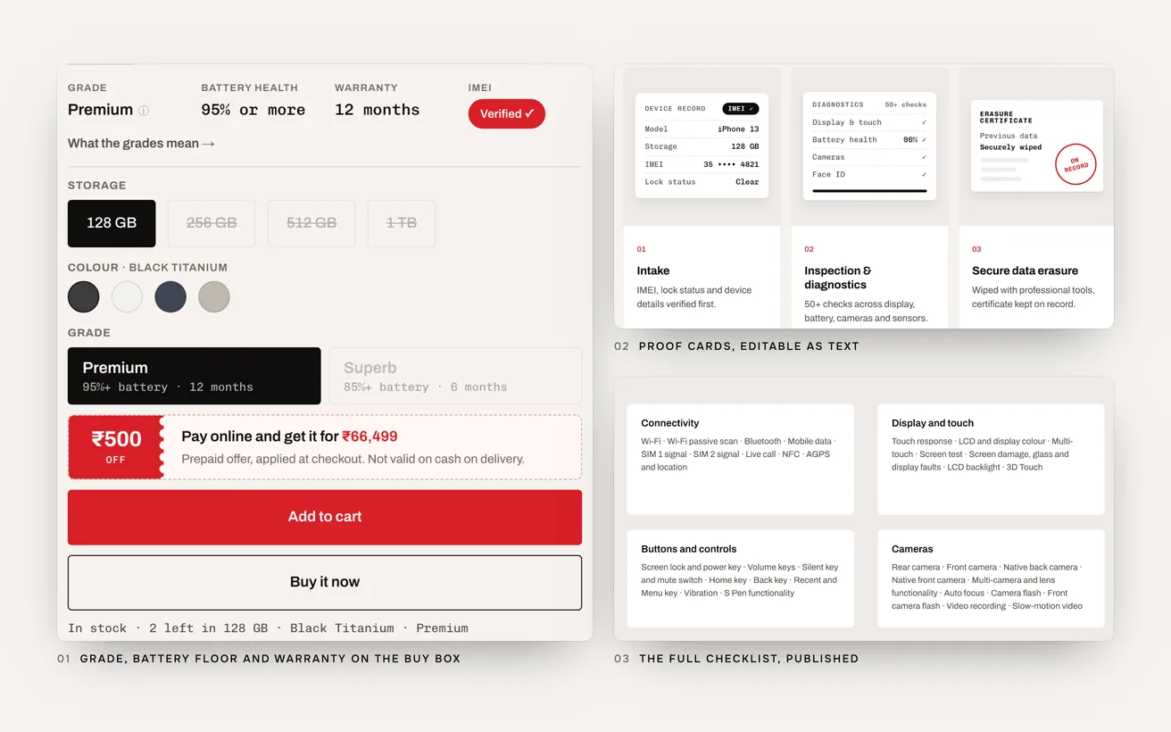
Each of the five objections is answered where it comes up, not on an About page. Battery and warranty sit on the buy box, the grading standard is one tap from every product, and the full inspection checklist is published. A WhatsApp button asks for the device report of the actual unit before it ships.

Technical

We started from Hyper, a premium Shopify theme, and replaced only what could not match the design. That came to 64 custom sections, each one editable by the MobiVerse team in the theme editor. The 28 changes inside the theme’s own files are marked, so a theme update can be applied without guessing what was changed.

Conversion

No countdown timers, no fake stock counters, no “23 people are viewing this”. Manufactured urgency contradicts the only thing this brand sells. The stock line on a product page states a real number, and the nudge before checkout is a person on WhatsApp, not a timer.

03 Design & UX

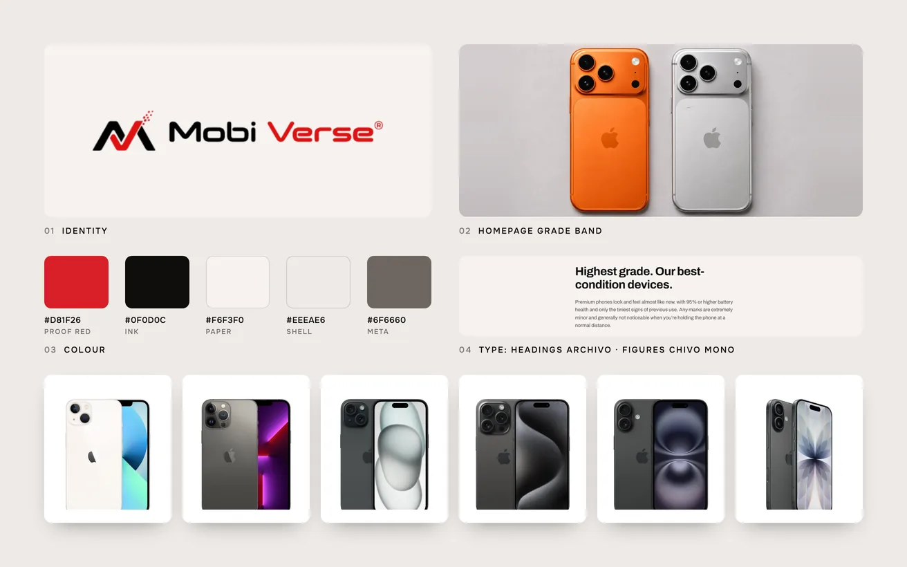
The identity is built to look measured rather than loud. Red means proof: it appears on the mark, the main action and anything that has been verified, and nowhere else.

The existing M mark was kept. Its bevel, gradient and drop shadow were removed so it holds at 24 pixels in a sticky header. The neutrals lean warm, closer to aluminum and paper than to gray. Archivo carries the headlines, and every figure, from a price to a battery floor, is set in Chivo Mono so numbers read like measurements.

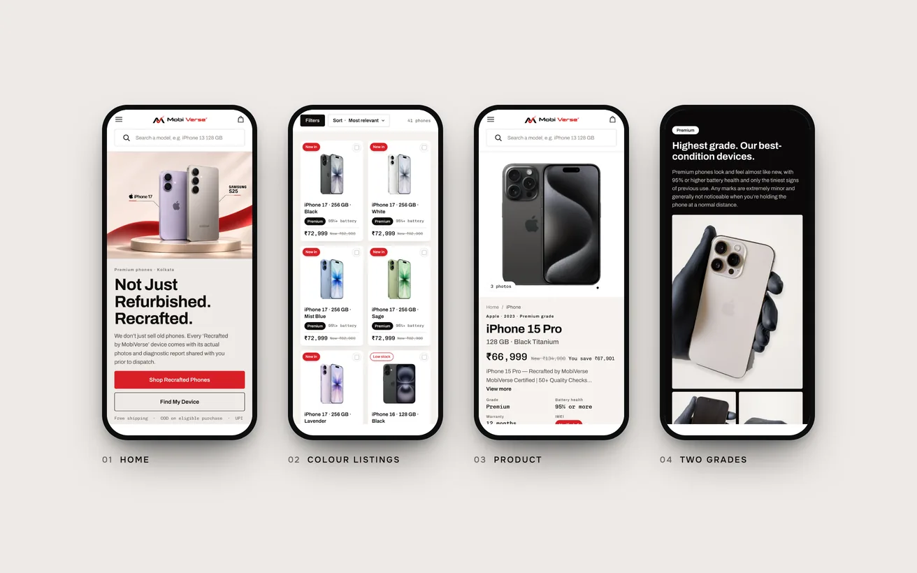
Mobile was drawn on its own, 20 frames at 390 pixels rather than a squeezed desktop. Card rails run off the edge of the screen, filters and the cart open as sheets, and add to cart stays in reach.

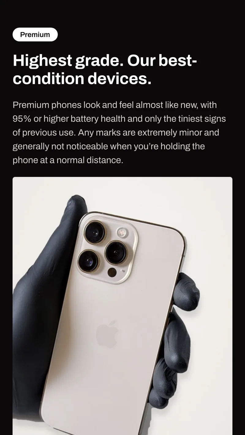
The MobiVerse grades page on a phone: the Premium grade with its battery floor and the client’s own reference photo

Two grades, not three letters

Premium and Superb replace the A, B and C the category uses. Each grade carries its battery floor and warranty on the same line, so the name is never the whole promise.

Figures set as data

95% or more, 12 months, 7 days. Numbers are set in a monospaced face and never softened into phrases like “excellent battery”.

The flaw named first

Grade copy describes marks the way a person would, before it says anything persuasive. Disclosure that comes first reads as confidence.

Retired words

Like new, 100% perfect, hassle-free and seamless are banned in the voice rules. Each one asks for trust instead of supplying evidence.

MobiVerse brand board: the flat M mark, Proof Red, ink, paper and shell swatches, Archivo headline specimen, the homepage grade photograph and six iPhones from the launch range

04 Development & technical implementation

The store runs on Shopify. A metaobject holds each grade’s battery floor, warranty and description, so every chip, product row and grade page reads from one place. When MobiVerse changes a warranty term, it changes everywhere.

The catalog was built as a pipeline rather than typed in. The client’s master sheet became structured data, specifications came from manufacturer pages, and a script created each model through the Shopify Admin API and checked it against its source. That produced 71 models and 1,786 variants across storage, color and grade. A second script cleaned 336 product photos onto one white canvas and swapped them in place, so no variant lost its image.

MobiVerse launched with eight iPhones in stock out of 71 models, so the store had to stay honest while it was thin. Collection pages list each color as its own card and hide sold-out colors. Empty collections say the range is launching soon and offer a WhatsApp alert. The Find My Device quiz reads live stock and greys out any answer that would return nothing; all 900 answer paths were tested on the live store.

Part of the job was absorbing change. The client revised the quality-check claim and dropped a named diagnostics partner late in the build. Each claim lives in a known set of places, so every change was a sweep of the store rather than a search.

Every section was compared with its Figma frame at 1440 and 390 pixels and held within 4 pixels of its designed height. Two audit passes covered 23 pages at four widths and ended with no blockers.

Close-ups of the MobiVerse store: grade, battery floor and warranty on the product buy box, the proof cards for each step of the process, and the published inspection checklist

05When the plan changed

When the plan changed.

Three weeks in, the brand’s central idea lost its first form. It kept its job.

Proof, not promises.

The internal rule from the MobiVerse brand book. Everything below had to pass it.

The brand book planned to publish each phone’s measured battery, IMEI status and replaced parts on its own listing. Then MobiVerse confirmed how the operation runs: listings are per model, and the actual unit is chosen after the order is placed.

Evidence about one phone cannot sit on a page that sells many. So the proof moved from the listing to a standard every phone must meet, a method anyone can read, and a report for the unit that ships.

TopicPlanned in the brand bookShipped
BatteryThe measured figure for that unit, on the listing.A floor per grade: 95% or more for Premium, 85% or more for Superb.
ConditionPhotographs of that unit’s marks.The client’s reference photos for each grade. The phone that ships meets or beats it.
TestingA check count with the checklist behind it.The full checklist, published by group on the grades page.
The unitIMEI status and parts stated on every listing.A device report for the allocated phone, shared on WhatsApp before it ships.
GradesA, B and C, each with a plain definition.Premium and Superb, each with its battery floor and warranty.

06Key solutions

Key solutions.

The parts of the build a visitor would point at.

  1. 01

    A published grading standard

    Premium is 95% battery or more with a 12-month warranty. Superb is 85% or more with six months. The phone that ships meets or beats its grade.

  2. 02

    The checklist on the page

    The full inspection checklist is published by group, so a buyer reads what was tested instead of a number on a badge.

  3. 03

    A report before it ships

    A WhatsApp button on every product asks for the device report of the unit allocated to that order.

  4. 04

    Discovery that knows the stock

    The quiz, the budget bands and the color cards only offer what can be bought today, and switch back on by themselves as stock arrives.

  5. 05

    Support in the brand

    Returns, dead-on-arrival and contact forms are designed in the MobiVerse style and land in Zoho Desk as labeled tickets. Tracking runs by AWB through Shiprocket.

  6. 06

    One reminder, not two

    Abandoned cart, checkout and browse emails go out in the brand palette, and the Shop app’s own reminders are off so nobody receives both.

07The result

The result.

What the build delivered. Trading results follow after launch.

1,786

Variants, launch-ready

71 models across Apple, Samsung and Google are loaded and checked. Eight iPhones are on sale at launch, and the other 63 models switch on as stock arrives, with no new pages and no developer.

0

Blockers at final audit

The second audit pass covered 23 pages at 1440, 1024, 768 and 390 pixels, every internal link, and the alt text on every image.

Trading figures will be added here after launch.

We publish conversion and return rates as the client reports them. The return rate is the one to watch: a low one is the evidence that the grading standard holds.

Not sure where to start?

Tell us the number that is stuck. A senior lead replies within one business day with an honest view, free.

Book a free consultation

or WhatsApp +91 70034 16634

9.9/10 client score · 150+ projects · 100% on time

08The finished site

The finished site.

The launch range on a phone: home, color listings, a product and the grading standard.

The finished MobiVerse store on phones: home, the all-phones collection with one card per color, the iPhone 15 Pro product page and the Premium grade

09Tech stack

Tech stack.

What it is built on, and what it talks to.

  • Shopify
  • Liquid
  • Hyper theme
  • Metaobjects
  • Admin GraphQL API
  • Python
  • Search & Discovery
  • Judge.me
  • Zoho Desk
  • Shiprocket
  • Shopify Messaging
  • Figma

10More case studies

More case studies.

Other projects where we named the number before we started.

eCommerce

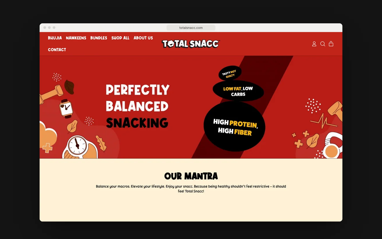
TotalSnacc launched from a standing start and took six figures in month one.

A launch store for roasted, never fried namkeen, built with no customer list behind it. Every rival in the category claims to be healthy and nobody is believed.

Revenue, month one
6 figures
Page load
<2s
View case study

eCommerce

Attackletics doubled sales with a neon storefront that opens like a plain one.

A smart batting tee and a finished coaching app, sold from a stock theme. Rebuilt in neon and scanlines, without making the phone pay for it.

Sales
2×
Order value
+35%
View case study

eCommerce

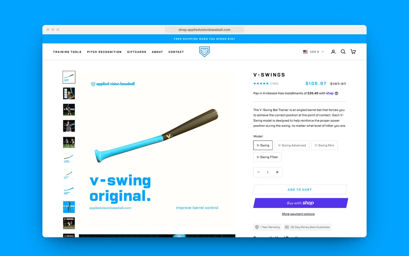
Applied Vision Baseball left a coaching site for a store that shows gear working.

Vision and swing trainers that make no sense in a photograph. Moved out of a coaching site and onto a storefront built around the demonstration.

Conversion
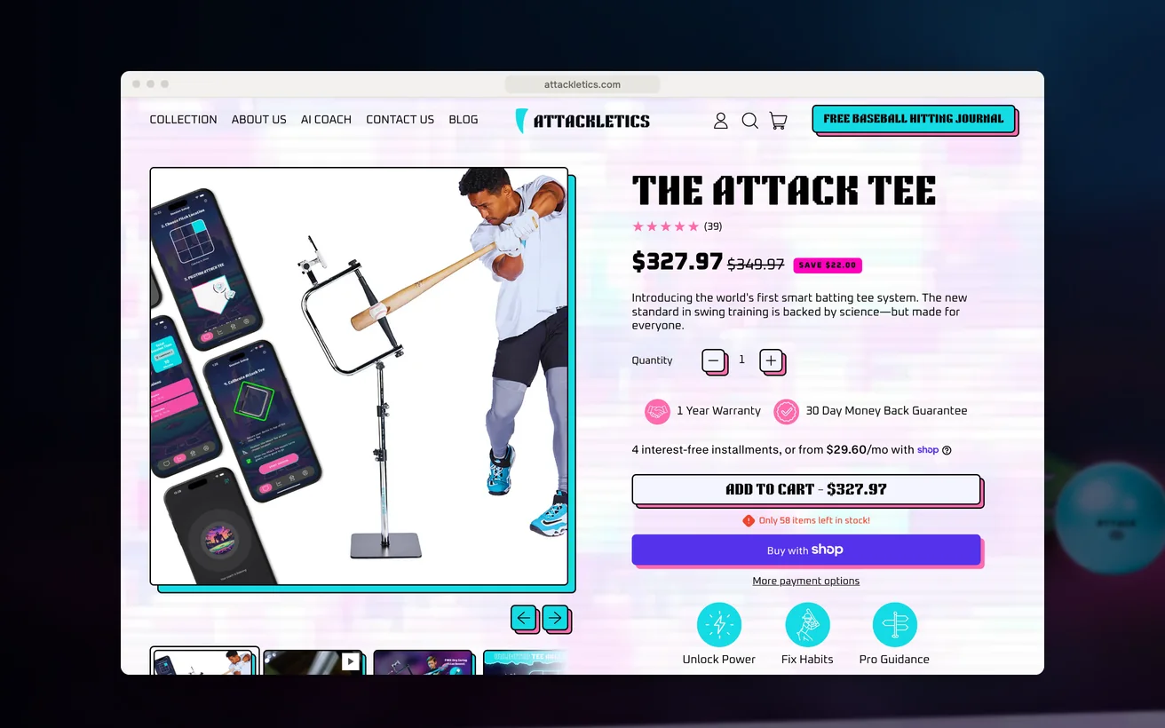
+46%
Organic traffic
+56%
View case study

11Start a project

Let us look at your numbers.

Send the metric that is stuck and we will tell you honestly whether we agree.

  1. Within 1 business dayWe read it properly and reply with real questions, not a templated brochure.
  2. A 30-minute scoping callFree, no obligation. We tell you honestly if we are the wrong fit.
  3. A written proposalScope, timeline, deliverables and the success metric, all on one page.

You'll hear back from a senior lead, never a bot.

    What do you need?

    NDA on request · Details never shared

    Question about your project? Tell us in 30 seconds and a senior lead replies.